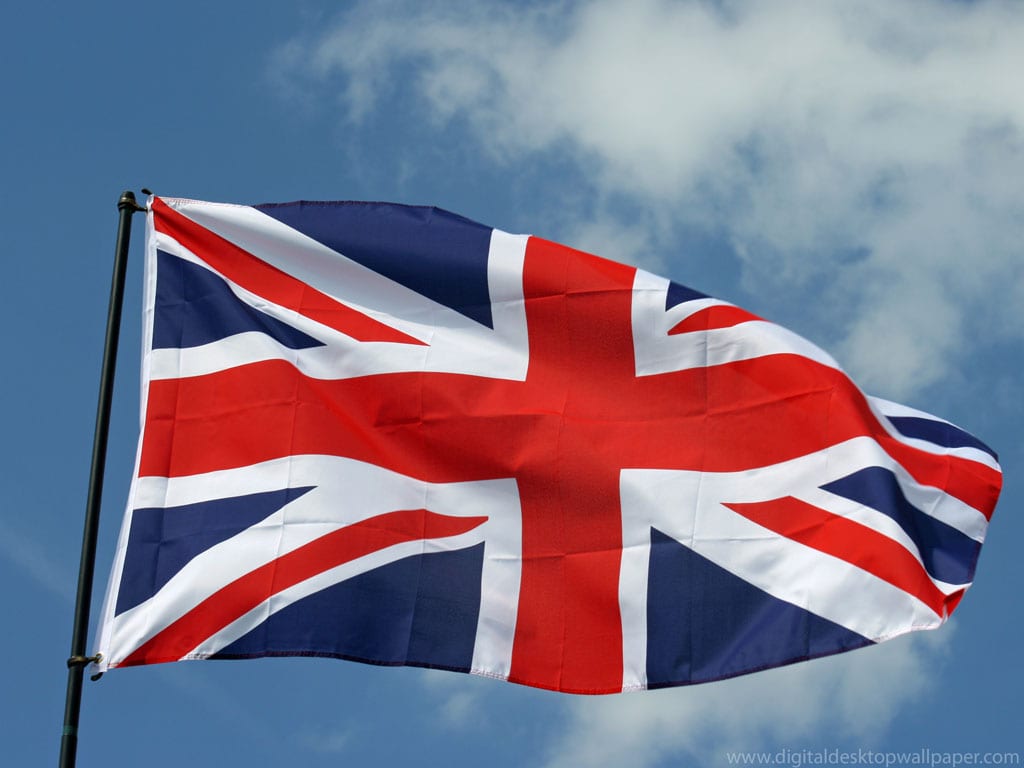
There are two things that BBC, The Church of England, London Underground, Penguin Books, and the London and North Eastern Railway Company, have in common; they’re all very British, and they all use either Gill Sans or Johnston in their branding.

Britain just has to be different, doesn’t it? First with its use of the pound currency instead of the Euro, and now its overuse of two typefaces that are almost identical instead of the generic Helvetica, Britain is famously unique. The “Helvetica of England,” as some like to call it, Gill Sans was designed by the Brit (surprised?) Eric Gill in 1926 who just happened to be the apprentice of the Johnston Sans (1916) creator Edward Johnston.
Image Source: Typotheque.com
Gill Sans is a little taller and has straighter edges than Johnston, but that is where their differences stop. In fact, Johnston doesn’t even come preinstalled in Microsoft like Gill Sans now does. The student is getting a lot more credit than the teacher. How have you used Gill Sans? Have you ever found a need for its curvier counterpart?


