In a perfect world, every business would have an ample marketing budget—one with plenty of room for developing a comprehensive brand identity system complete with a top-notch logo. In that same world, I would also have hundreds of well-defined abs.
Unfortunately we don’t live in that world. I don’t have a single ab that I know of. And you don’t have a real marketing budget. That’s why you’re going to design your own logo no matter how many designers like me try to convince you otherwise. So instead of trying to talk you out of it, I’ve decided to highlight some of the most common mistakes I see non-designers make, and hopefully help you avoid making them yourself. I thought the best way to illustrate these points was to show you how quickly some very famous logos go from “global market” to “your local chamber of commerce newsletter” with just a few missteps (all apologies to the original designers).
Here are 10 avoidable logo design traps, loosely arranged from concept to execution to presentation:
1. Be careful with clichés.
What they didn’t do:
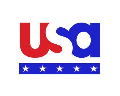
I can’t even imagine a potential client with “USA” in their name not insisting that their logo be red, white, and blue with stars. “Well, we’re ‘USA Dog Sweaters,’ so it kind of has to be a red, white, and blue dog with a star sweater,” said the imaginary client assertively. “But we trust you.”
What they did:
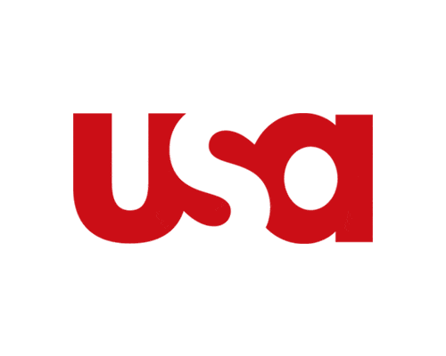
Much like USA Network barely includes a nod to the American flag (even the red isn’t consistent—they display their logo in a variety of colors), don’t feel that you need to adhere to clichés or literal interpretations of your brand’s name when creating your logo. Just because you’re an optometrist doesn’t mean you need to include a pair of glasses. Realtors don’t have to have a roof over their names. There’s nothing wrong with referencing your trade, but looking just like all of your local competitors by sticking to tacky or tired images is not the goal.
In this case, the logo is successful because the designers focused on a clean, well-executed mark—not because it evokes the stars and stripes.
Takeaway: Your logo doesn’t need clichéd imagery or themes.
2. Don’t overexplain.
What they didn’t do:

Along the same lines as the cliché example above, I find that many do-it-yourselfers feel the need to describe every facet of their businesses in their logos. It reminds me of the phrase “including but not limited to” that I see in a lot of marketing material. “We offer many kinds of tools, including but not limited to hammers and saws.” Businesses seem strangely concerned that customers can’t make the simplest logical connections when it comes to goods and services. “Well, it only says ‘hammers and saws’ so they must not have screwdrivers.” Nobody thinks like that, right? So just because there’s no giraffe in your logo, it doesn’t mean people will automatically assume your business has nothing to do with giraffes.
What they did:

While we certainly don’t all have the iconic yellow magazine border to use as inspiration for our branding, the approach is still applicable in most cases. You don’t have to illustrate every (or any) service or product you offer as part of your logo! In fact, you’d be hard-pressed to find a company that is able to do so. Imagine what the Amazon logo would look like if it included a reference to every product they offer. And do you know anybody that has been surprised to find that Apple doesn’t sell apples, or that they couldn’t see a mermaid at Starbucks ? Yet we constantly hear design feedback along these lines: “We don’t think the car should be blue, because then everyone will think we only sell blue cars.” No they won’t. I promise. Everybody knows that National Geographic sometimes includes photos of giraffes, and everybody also knows that they don’t sell yellow rectangles.
Takeaway: Your logo isn’t a catalog of everything your company offers. It’s better to focus on an overall mood or a simple representation.
3. Avoid mixed metaphors/symbolism/decoration.
What they didn’t do:
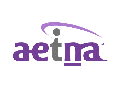
This one is a little tougher to quantify, but I couldn’t help but think as I tried to intentionally trash the Aetna logo that the end result wouldn’t get a second look in the local newspaper. It feels like every day I see inexplicably connected characters, strange type customizations, and whatever we call these curvy things. Some of my favorite logos are ones that are primarily type-based and may rely on some sort of clever design artifice for added oomph (the famous arrow in the FedEx logo, for example); however, amateurs often seem to take the “more is more” approach when it comes to logo design. “We’ll make the ‘M’ a mountain, replace the ‘O’ with a globe, and make the ‘S’ backwards. And pink.”
What they did:
In most of its incarnations over the years, the Aetna logo has featured the “ae” ligature as its focal point. You’ll notice that there is only one focal point. It’s graceful, it makes sense, and it does just enough to give the type some added style. If you find yourself blindly turning your “A”s into pyramids and trying desperately to connect all of the letters together into some unholy 1980s maze, take a breath and ask yourself if any of it is actually helping the design or your brand.
Takeaway: If your logo revolves around a design conceit or visual effect, don’t water it down with other meaningless decoration.
4. Stay away from “cool” fonts.
What they didn’t do:
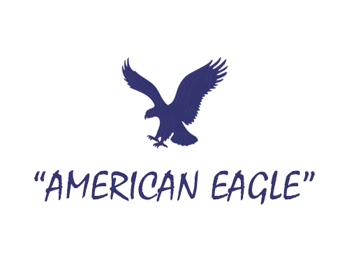
In putting this article together, I think I may have finally come to an understanding of why things like this happen. Non-designers that are designing their own logo want to use a “cool” font. “Cool” in this case is synonymous with “different than what I’m used to seeing.” Most people have a computer or a program preloaded with a handful of system fonts, and when they sit down to type out their company’s name, they don’t want to see it in Helvetica, Tahoma, or Calibri anymore. They want something “cool.” Something like Mistral (above), Curlz, Brush Script, or Papyrus. Unfortunately, “cool” and “different” are not synonymous. Ironically, in an attempt to be different, they end up with a logo that looks just like all of the others in the newsletter or ad book.
What they did:
Though they have since rebranded, the previous American Eagle logo was an example of a simple, classic serif typeface used to great effect. There’s nothing especially “cool” about this font. What it is, however, is classy, sturdy, and well-designed. Sounds like something AE might want to say about their clothing, no?
Finding a typeface that’s cool, but not that kind of cool, is easier said than done. So, unless it’s on the more basic end, I’d recommend staying away from your system fonts. Most of them were never meant to be used in commercial design to begin with. Instead, take a look at free resources like Google Fonts or Font Squirrel for ideas. You’ll still need to be choosy, but there are plenty of quality free-to-use typefaces out there if you’re willing to take the time to find them.
(P.S. The quotes in the bad version above are a free bonus tip. You don’t need quotes ANYWHERE in your logo. Or around your slogan. Or your web address. Maybe this should be its own post…)
Takeaway: “Different” doesn’t necessarily equal “cool” when you’re flipping through your system fonts. Look elsewhere for quality typefaces.
5. Ditch the clipart. Please.
What they didn’t do:

Yeahhh buddy! I’m Jeep. I sell Jeeps. I need a Jeep in my logo. I can’t draw Jeeps though. No sweat, bro. There are thousands of dope pictures of Jeeps online. Bang. Done.
What they did:

This one is easy. It’s probably the only one that no other designers will argue with me on, yet I see non-designers do it constantly. Don’t use clipart/random images you find on the internet in your logo. If you won’t take my word for it, take the word of every company in the Fortune 10,000. Is that a real thing? If it is, I guarantee you won’t find a single piece of clipart in any of their logos.
If you’re not the sort to create graphics, you have a couple of options. The first is one that most do-it-yourselfers never consider: go without a graphic. There are countless examples of successful logos that rely on very little or no graphical embellishment (see Jeep above, Kellogg’s, Philips, etc.). If you can find the right typeface, balance, color, etc., then you may be able to do without graphics at all. Or maybe you have great handwriting, and a manually written mark would work.
If you absolutely must have a graphical element of some kind, at least start at a stock house. A site like iStock offers low-cost illustrations that you can use as the basis for a logo, and with a little searching you’ll find graphics of much higher quality than you would in a random Google search (not to mention you won’t risk infringing on anyone’s copyright).
Takeaway: Don’t use clipart in your logo. Ever. Seriously, man.
6. Don’t make things needlessly complex.
What they didn’t do:
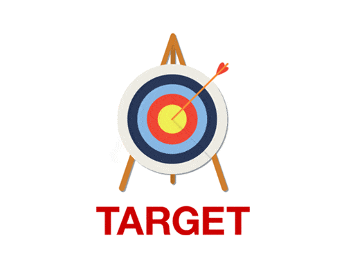
As much as it pained me in the previous point to suggest using a stock illustration in your logo, the whole idea of this post is to provide practical tips. In the real world of limited expertise and even more limited budgets, I think it’s a perfectly acceptable approach. I will offer this caveat, however: every illustration is not a logo. There are some amazing illustrations out there that would make for some really lousy logos. I suppose this goes hand-in-hand with the point I made about overexplaining. The tendency I see is for people to create/choose logo graphics that are needlessly complex in an effort to make their brand seem more substantial. But the goal of your logo isn’t to accurately illustrate an archery target, or a sandwich, or a remodeled kitchen. It’s to make sure people remember and recognize your brand.
What they did:
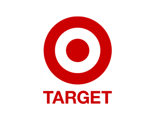
Nobody will argue that this is a 100% accurate representation of any target outside of Road Runner cartoons. But it is exceedingly memorable. No arrows, multi-colored rings, drop shadows, or added dimension. In my experience, a lot of clients (especially if they’ve never paid for design before) see a design like this and assume it took very little work because of its simplicity. Any designer that’s ever had a client tell them, “Well I could do that,” knows exactly what I mean. Yes, you could technically draw two red circles on your computer. But luckily for my career and that of every other designer, you almost never do. You add arrows and shadows and extra rings to make it look more like a target and more like somebody spent enough time on it. I assure you that’s not the point. Look at the two examples above again and ask yourself not which one is a better target, but which one is a more successful logo. It’s no contest.
Takeaway: Keeping your logo simple will generally make it more memorable.
7. Make sure we can see it.
What they didn’t do:
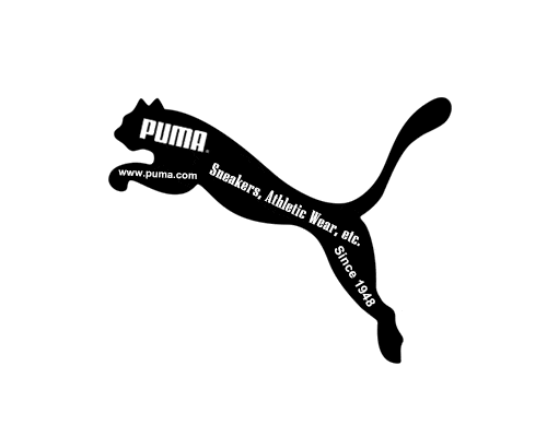
This is another one that I’d like to think falls into the no-brainer category, but the number of logos I see that are indecipherable at even moderately small sizes tells me otherwise. Amateur designers really seem to like including ancillary information or elements at the expense of clarity. Your services, slogan, website, etc. almost certainly have no place in your logo proper (a “.com” at the end of your business name being a notable exception).
Sometimes the brand’s name is illegibly small for no discernible reason at all. I can only assume that in the process of creating the logo, the non-designer is more likely to lose site of the fact that the mark will be reproduced at sizes much smaller than their original image. Or that it will often be seen from a distance greater than that between their eyes and their monitor. We’d all love to be in a place where we could drop the name from our logo and just be a swoosh, an apple, or golden arches. Until then, however, you need people to see your name. How readable is your logo at 1 inch wide in print? Half an inch? How about 100 pixels?
What they did:
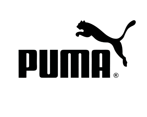
Any well-known logo could have worked here, really, but Puma is a great example. As ubiquitous as the jumping cat may be, the simplicity and readability of both the cat and the wordmark can’t be overstated. The fact that you could reduce either one on its own to the size of a flea and still instantly recognize it speaks volumes.
Takeaway: Make sure your logo is easily readable, even at small sizes.
8. Be assertive (but thoughtful) with color.
What they didn’t do:
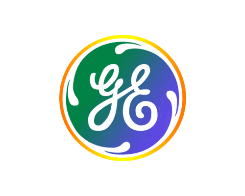
Yikes. This might be the easiest way to instantly “amateurize” any of the real logos included in this list. Right along with the “cool fonts” and “simple is boring” approaches generally comes “we want it to be colorful.” In fact, I can’t think of a single time anybody ever requested that their logo be “one color” or have a “limited color palette,” even though that’s probably exactly what it should be. When most people hear a term like “monochrome,” they immediately associate it with words like “conservative,” “muted,” or “dull.” And since nobody wants customers to think their company is dull, their natural reaction is often to swear a solemn vow to include as much color as they can. And they end up with something like what you see above. Whatever that may be.
What they did:
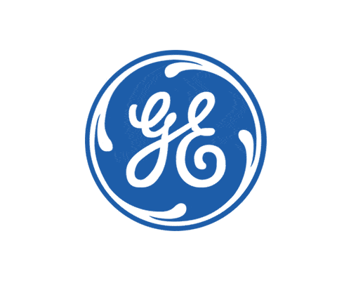
Ugh, just one flat color. And blue, no less. How boring, right? How would it affect your view of GE if it were purple, red, or green? Over time, colors have developed connotations that our simple brains rely upon constantly. For instance, blue is often associated with tradition, loyalty, confidence, and stability. In the case of GE, these are qualities that it would make a lot of sense to want to convey in a logo. Though many would consider blue the most boring color, here it’s the assertiveness with which it’s used that makes it so successful. The message is that GE is a brand you can trust and that will always be there for you. The designers didn’t throw in hints of red or orange to also remind people that GE can be fun, too.
If asked, most people would be able to tell me instantly, without thinking, that that GE is blue, Coca Cola is red, and Hershey is brown. What color is the first example? Purplish-green with some goldish-orange? Sure it’s “colorful.” It’s also “horrific.” I’m not saying your logo should only use one color, but whatever colors you choose, choose them for a reason—even if it’s just “this looks good.”
Takeaway: Pulling off a logo design with many colors or drastic gradients isn’t easy. Start simply and choose wisely.
9. Prep your files appropriately.
What they didn’t do:
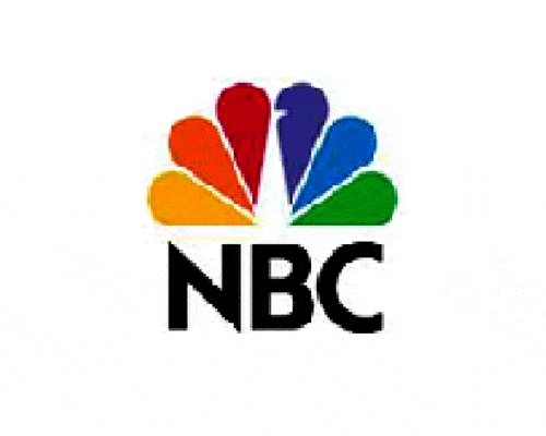
These last couple of examples are all about presentation, and are arguably the easiest ones to avoid. You don’t have to look too far on the internet or in print to find examples of pixellated logos (which result from scaling raster images up from their original size). You’ll also likely recognize the ugly blotches all over this example, which we call “artifacts” and are a result of over-compression.
What they did:
Even a great design is going to look like absolute shit if you create it at the size of your website header and then slap that same file on the side of a van. Unless of course you create it as vector artwork (and you totally should). The TL;DR version: vector graphics are scalable to any size without a reduction in quality. While not everybody has access to Adobe Illustrator, there are several free, open-source options out there for creating vector graphics, such as Vectr or Inkscape. If you’re designing your own logo but don’t have much experience with graphics, I highly recommend at least familiarizing yourself with the terms “raster” and “vector” and what they mean as far as production goes. If all else fails, create the original design as large as you can—you can always make it smaller, but you can’t necessarily make it bigger without it looking like garbage. The printer or web designer that you hand the file over to would much rather have an image that’s larger than it needs to be, trust me.
Takeaway: Design your logo at high resolution, or even better, in a vector format. From there, you can always go smaller if you need to.
10. Don’t distort it.
What they didn’t do:
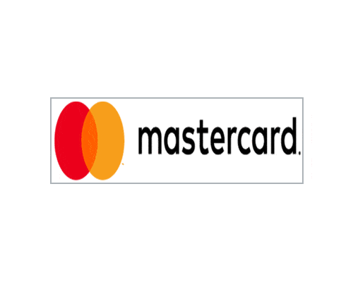
Finally, one of my all-time favorites. Another that I’d like to think is an obvious no-no, but I still see almost daily. It’s the old “my logo is a wide rectangle but it needs to fit into a narrow rectangle, so let’s smash it in there as big as we can get it” move. Or even worse, distorted type that is part of the original logo itself.
What they did:
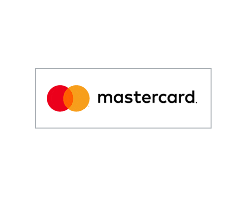
Another thing that I find non-designers have an aversion to is white space. I’ve heard a hundred different versions of “I’m paying for this space so I want to use as much of it as possible,” or the ever popular “make the logo bigger.” However, what’s much more important is that your logo is readable, balanced, and consistent. Typography in particular is meticulously designed and should never be resized disproportionately. The same goes for circles—otherwise they aren’t circles anymore. In most graphics programs, holding the Shift key while resizing something will ensure that it maintains its proportions. Get used to using that and it will quickly become second nature. If it turns out you find a spot where your standard logo just won’t fit correctly, you may need to create alternate versions. Just please don’t smash anything.
Takeaway: Don’t distort the proportions of your logo to make it fit a particular space. Either stick to the original proportions or create a secondary version for different uses (e.g., horizontal/vertical orientations).
Wrapping up
Like I said originally, I’d always recommend hiring a professional to develop and design your brand identity/logo if you can afford to. But I also know that isn’t realistic for a lot of small businesses or entrepreneurs who are just starting out. If you are a non-designer who has no choice but to do it yourself, I believe following some basic guidelines can help you avoid some amateur mistakes we see all the time. To recap, here are the takeaways from the 10 examples above:
- Your logo doesn’t need clichéd imagery or themes.
- Your logo isn’t a catalog of everything your company offers. It’s better to focus on an overall mood or a simple representation.
- If your logo revolves around a design conceit or visual effect, don’t water it down with other meaningless decoration.
- “Different” doesn’t necessarily equal “cool” when you’re flipping through your system fonts. Look elsewhere for quality typefaces.
- Don’t use clipart in your logo. Ever. Seriously, man.
- Keeping your logo simple will generally make it more memorable.
- Make sure your logo is easily readable, even at small sizes.
- Pulling off a logo design with many colors or drastic gradients isn’t easy. Start simply and choose wisely.
- Design your logo at high resolution, or even better, in a vector format. From there, you can always go smaller if you need to.
- Don’t distort the proportions of your logo to make it fit a particular space. Either stick to the original proportions or create a secondary version for different uses (e.g., horizontal/vertical orientations).
Hopefully these help! Think I missed something obvious? Think I’m an idiot? Get in line! I mean, let’s hear about it…


