We all remember the Great Gap Gaff of 2010.
The classic-looking, well-known clothing retailer rebranded in the midst of the holiday season and rolled out a new logo for the first time since 1986. And, boy, did it bomb. The internet was abuzz for the 6 days it was out in the world (and thereafter). That’s right—6 days. Gap quickly folded (I refuse to say “pun intended” here) and restored their old logo to save face.
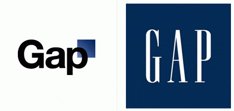
Lesson learned: A brand refresh isn’t always a good idea.
Sure, we’re not all lucky enough to be world famous like Gap, but we should still tread lightly around the decision to rebrand.
First things first: In order to rebrand, your company has to actually have a brand. A logo does not a brand make, as the popular saying goes. The same is true for business cards and other marketing collateral. A brand consists of a vision, a mission, and values—and sure, your outward appearance. It’s who you are and what you look like all rolled into one (hopefully) shiny identity.
How do you know it’s time to rebrand?
Unfortunately, there’s no rulebook for determining which brands should get an overhaul, but here are three sure signs that you should re-evaluate.
1. Your brand looks and feels outdated.
If your logo was designed in 1989, there’s a good chance it looks outdated, even if you don’t think it does. Did you use a bubble font to keep up with those times? Time to say goodbye. Unless you’re selling Bubble Tape.
Just kidding, they rebranded too.
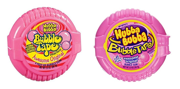
Outdated fonts can be a sure indicator of a tired logo. What might’ve been regarded as contemporary 30 years ago likely won’t hold up today. You should aim for fonts that can stand the test of time and are classy, sturdy, and well-designed.
Your content should also give off the impression that it was created in this century. Today, video is king. Infographics are queen. And text is…jack? What I’m saying is, text just doesn’t have the same appeal as visuals, and if your brand is relying solely on copy to communicate your company’s identity, then it’s probably due for a refresh.
And don’t forget about your website. The technical aspects of how you present your brand are especially important today. If your site isn’t optimized for mobile devices, you’re way behind. This year, it’s projected that 63.4% of all mobile phone users will access the web using said phones, so a frustrating mobile user experience can quickly lead to a negative brand image. My dad is the only person still flipping open a phone and, trust me, he doesn’t give a damn about your website anyway. You should be tailoring your site to the rest of the population, making sure it’s mobile friendly.
2. You’re not confident in your own branding.
Speaking of your website, if you’re embarrassed to give out your site’s address—or you claim to be “fresh out” of business cards when you have a pocket full of them, then something is obviously wrong. If you aren’t confident in your own brand identity, how can you expect potential customers to be?

You’re not alone. A few years back, we realized our own website was lagging behind while we were busy with client work. That’s not a good look for a company that designs websites, so we had to make it a point to bring our own site into the twenty-tens. We made visual and technical updates, created content offers, and became more social—all things that made us more confident in our own brand and allowed us to get excited about it again.
If you’re not proud of your brand, your potential customers will feel this disconnect and you’ll likely miss out on some opportunities to build relationships. Perhaps your lack of confidence isn’t just because of your look; it could stem from a hasty merger with another company that wasn’t entirely fleshed out, or from negative publicity that resulted in a poor reputation, like BP or Uber. Regardless of what’s causing your apathy toward your brand, it is essential that you transform it into something you are proud to put in front of customers.
3. Your brand is confusing.
If your brand has ever been mistaken for that of a competitor, I think we can agree that’s a bit confusing. If it was a strategic move to mimic a successful company, then hey, nice work. But that’s not fair to you or that competitor. Differentiating yourself from the competition is what competition is all about, right? That’s not to say that you should be different just for the sake of it, but reformulating your image to show who you are rather than who your competitors are could help set you apart.
Your company could also come across as confusing if your business has evolved from what it was at the outset, but the messaging hasn’t caught up. You should rebrand if your product, service, or mission has changed and what you say stops reflecting what you do.
For example, in 2016, CVS Pharmacy became CVS Health after acknowledging that their services had expanded beyond the traditional pharmacy model. They restructured by creating four separate brands that each offer products and services in a different area of personal wellness. They used their existing name and typography for the parent brand, leveraging their brand equity and proving that you don’t have to overhaul your company entirely. But they also stopped selling cigarettes, highlighting their new mission for social responsibility.
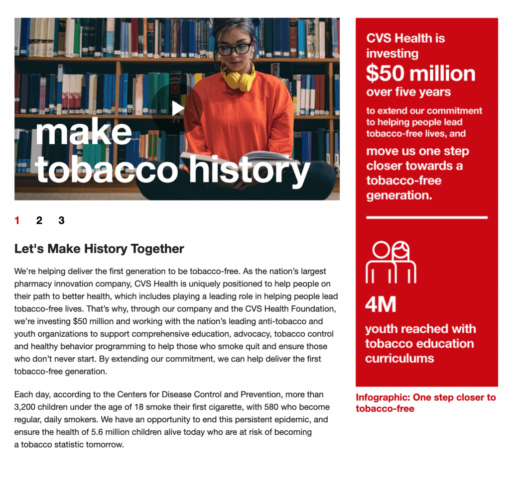
Time for a change?
If you’re sick of the words “rebrand” and “refresh” at this point, thanks for reading this post in its entirety. The fact that you were reading this at all tells me that you must be considering rebranding.
Now, we’re not the authority on what’s best for your business, but we’ve been around a while and have been a part of some pretty successful branding and rebranding projects. There are a hundred reasons to consider rebranding, but three easily identifiable ones are: your brand looks and feels outdated, you’re not confident in your brand, and your brand is confusing.
If you do decide to change things up, remember that followers of your brand might not love a rebrand at first just because it’s not what they’re used to. But, unless you’re getting true backlash (like Gap), give them time to warm to your new look.


